

Five resources every week with actionable takeaways to make you a better designer.
Have you ever wondered why that one app just feels more intuitive than others? Or why certain designs just click while others feel off? Well there's actually some psychology behind it. This week, we're diving into the Gestalt principles—a set of rules explaining of how we perceive and organize visual information. These aren't just dusty psychological theories—it’s one piece of the puzzle of how our brains actually interact with the world, and why designs “just work.”
This edition is a bit different because I’m only sharing one resource, but it’s a Links for Thinks original resource—a first of it’s kind!
I had a blast building this website, so if you think anyone would find this of particular value OR you have an idea for another resource you think would be cool—reply to this email with your thoughts, I’d love to hear em!
Let’s dig into a few of these principles.
— Jake
TODAY'S EDITION

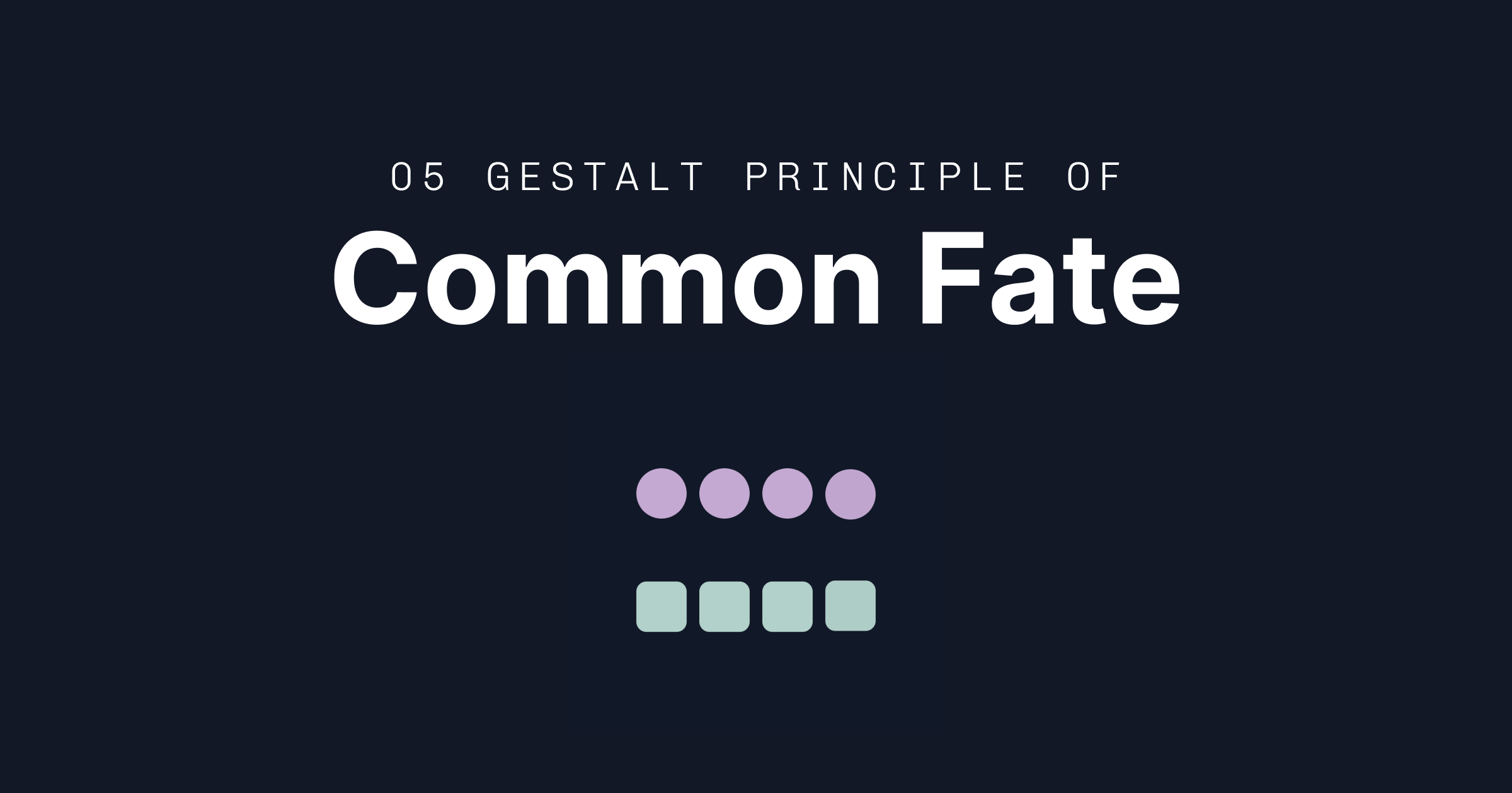
THE GROUP DANCE
Watching words slide perfectly into place after a correct match in NYT Connections. Seeing Spotify's playlist drawer rise smoothly with all its contents in perfect unison. These moments of synchronized motion aren't just delightful animations—they're common fate in action. It's a powerful principle that turns simple motion into meaningful connections, making our digital experiences feel more natural and intuitive.
THE JUICE
Motion With Meaning: Elements moving together aren’t always there just for your “ooo’s” and “aahhs”—they can create instant relationships in users' minds making everything connected and more usable.
Shared Transformations: Combining the principle of similarity, things that change together (fade, scale, move) feel more connected and part of a group.
Group Dynamics: Think of synchronized animations like a well-choreographed dance. When emails all sweep away during a bulk delete or when tasks on a kanban board shift together during a drag-and-drop, folks instantly understand these elements are part of the same story. No instruction manual needed.
Don’t be Distracting: Don’t overdo it. Too many animations can be confusing and distracting.
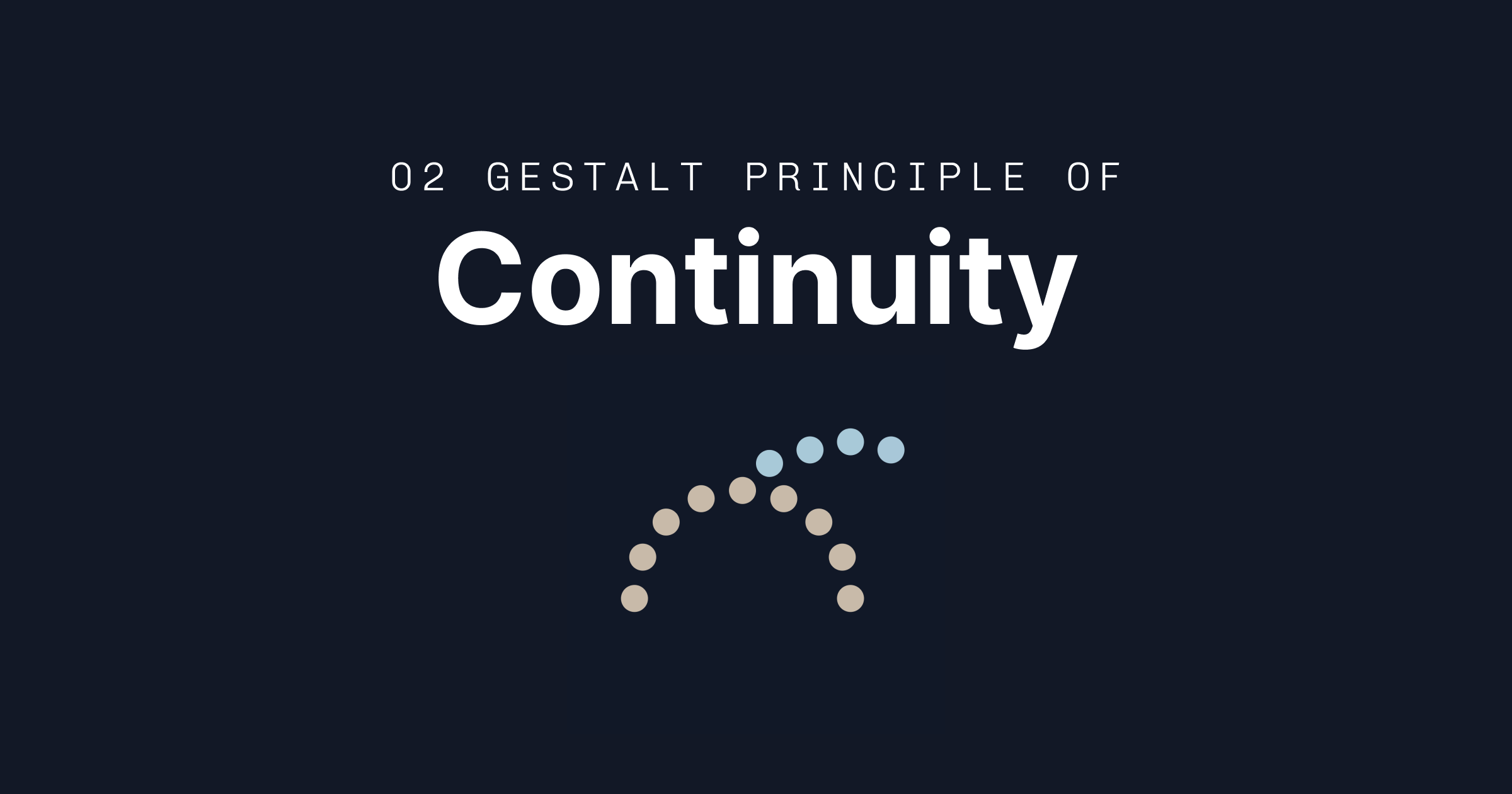
THE NATURAL PATH
Remember how satisfying it was to complete your first Duolingo lesson, following your progress path to the next lesson? We’re experience the dopamine rush given by continuity—our brain's tendency to follow smooth paths and perceive continuous patterns. It's all about about creating intuitive guides that make experiences feel natural.
THE JUICE
Momentum Matters: Once users start following a path, they'll want to continue. It's why Netflix auto-plays the next episode and why doom-scrolling is a thing. Use this power responsibly—make sure you're leading users somewhere worthwhile.
Visual Path Rules:
Design navigation that follows natural eye patterns
Create clear visual hierarchy from one element to the next
Connect related elements through alignment
Know when to break the flow for emphasis
Directional Design: Use natural reading patterns for your audience. Left-to-right for Western users, right-to-left for Arabic, etc. But also consider digital patterns—we expect menus to dropdown, drawers to slide up, and breadcrumbs to go left-to-right.
Breaking Patterns: Time to break the rules. Breaking continuity works well if you’re trying to do things like signal a context shift or highlight something important. Disrupting established patterns can be as powerful as maintaining them—when done purposefully.
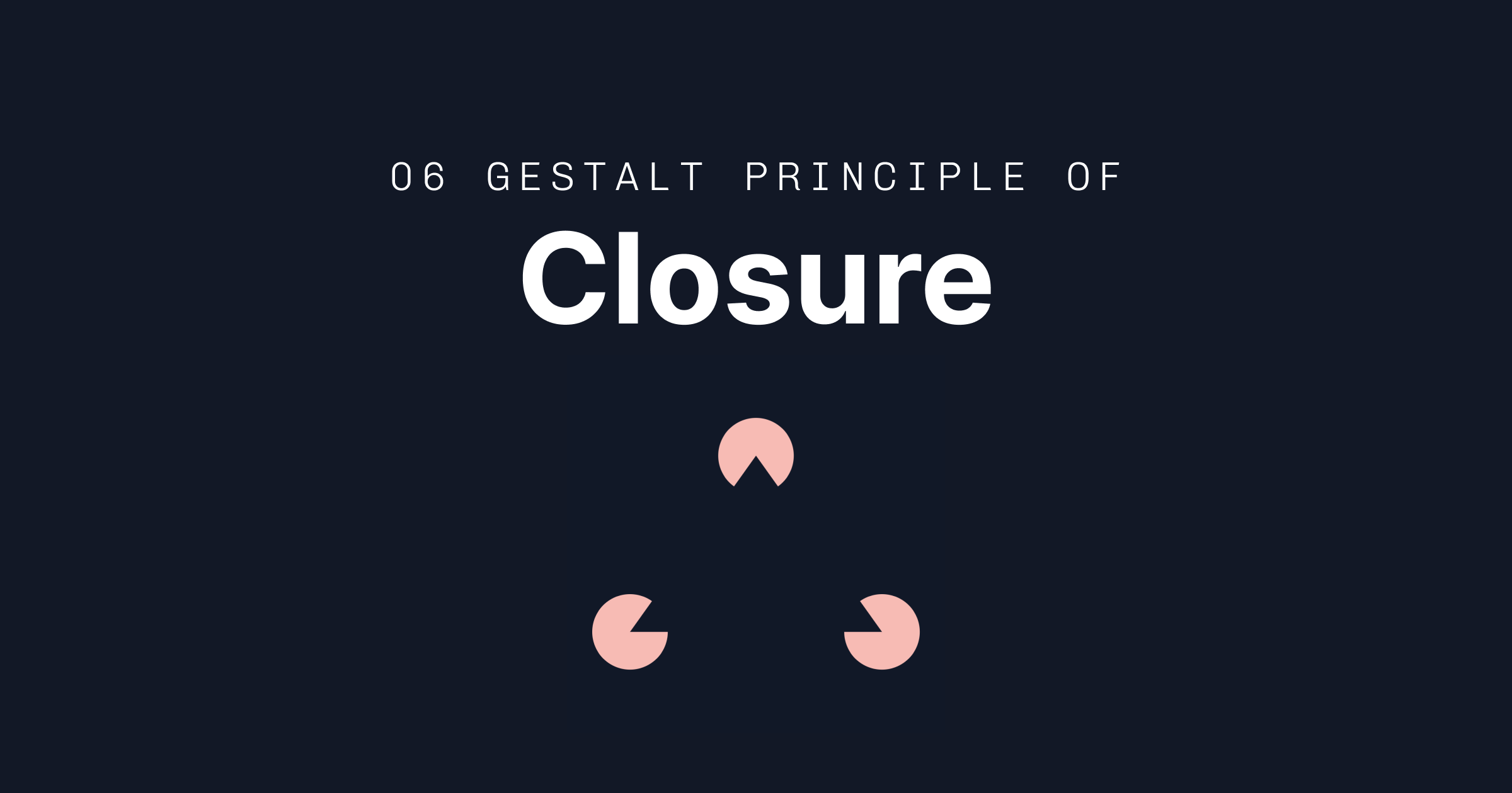
CONNECTING THE DOTS
You know how you still picture a face in Apple’s Face ID logo/animation even though it’s actually not fully there? Or can read txt evn thgh its mssng lettrs? Your brain's amazing ability to fill in the gaps and complete partial patterns lie within the principle of closure.
THE JUICE
Partially Powerful: Sometimes showing less actually communicates more. There aren’t actually three heads in the PBS logo—but your brain has no problem seeing them.
Strategic Incompleteness: Use gaps intentionally to create engagement. It's why LinkedIn shows partial profile views to logged-out users, or why Spotify's playlist covers sometimes peek out from the edge of the screen. Your brain can't help but want to complete the picture and click or scroll.
Balance Mystery and Clarity: There's a sweet spot between intriguingly incomplete and frustratingly unclear. The WWF panda is clever; a completely abstract icon for a critical function is just confusing. Remember: you're (probably) designing for users, not winning design awards.

THE SIMPLE TRUTH ABOUT SIMPLICITY
It’s okay, you don’t need to say it out loud. Prägnanz is also known as the law of simplicity. It's the idea that our minds prefer things as simple as possible—but no simpler. Aka if it doesn't spark joy or serve a clear purpose, maybe it doesn't need to be there.
THE JUICE
Simplicity is a Feature, Not a Bug: In a world of endless options and infinite scrolls, clarity becomes a superpower. It's why Google's homepage is still basically just a search box.
Mental Models Matter: Users of your stuff come with built-in expectations. Work with them, not against them. It's why shopping carts are still shopping carts and save icons are still floppy disks (though maybe it's time to revisit that one).
Reduction > Decoration: Before adding that extra animation or that trendy gradient, ask yourself: does this help users understand or accomplish something? Sometimes the most powerful addition is subtraction. Just remember—simple doesn't mean boring. Think Nintendo Switch: minimal design, maximum fun.
Progressive Disclosure: Don't dump everything on users at once. Layer complexity like a good onboarding flow—show the basics first, then reveal more as needed. It's the difference between a good tutorial and an overwhelming manual.
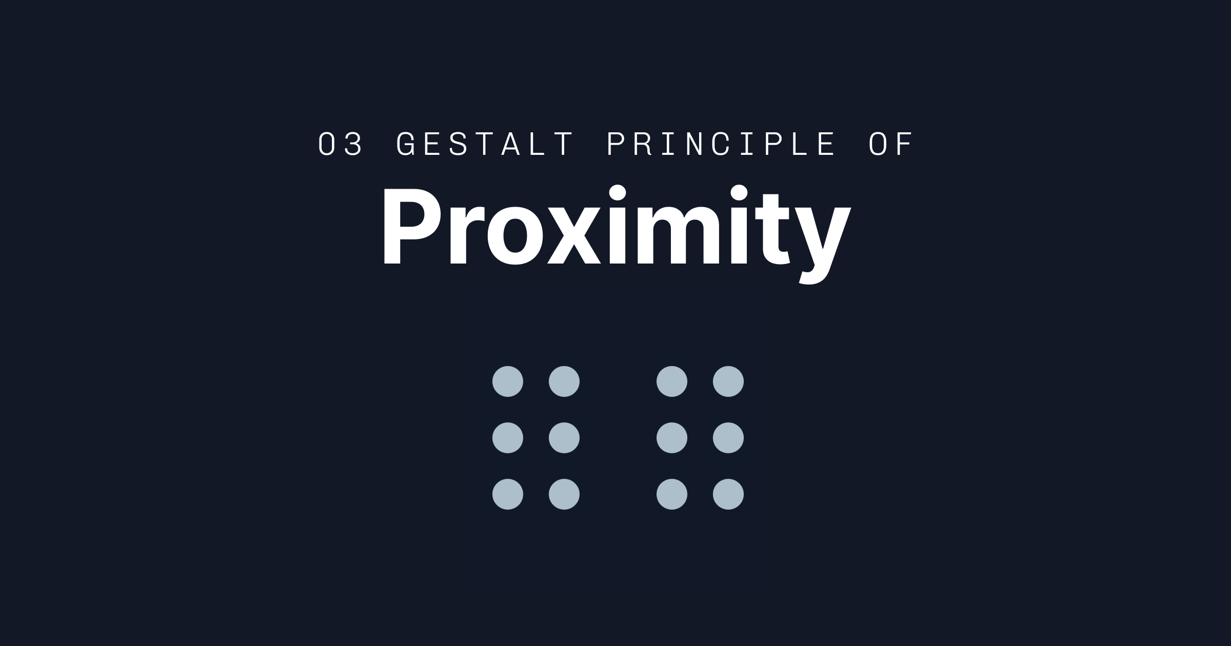
DISTANCE MAKES THE BRAIN GROW FONDER
Our brains are wired to see things that are close together as related. And guess what? This same principle is secretly powering most of the interfaces you use daily, from your favorite media websites to your Netflix recommendations.
THE JUICE
Space Signals Relationships: Close things? Related. Far things? Probably not so much. It's why Figma’s properties panel groups things closer together depending on the action and why your iPhone groups notifications by app. The closer things are, the stronger the perceived connection.
Think in Chunks and Breathe: Break content into digestible groups, but don't forget the whitespace. Think of it like organizing a closet—items need to be grouped logically, but you also need room to see what you've got. Too cramped and everything becomes one big mess.
Context is King: Distance is relative to the overall layout or platform. What works on a massive 4K monitor might feel suffocating on mobile. Design your spacing like you're arranging furniture—what feels right depends entirely on the room size.
Natural Grouping > Forced Structure: Sometimes you don't need borders or backgrounds to show relationships, save that for when you really need Common Region. Good spacing can do the heavy lifting, creating natural groups that feel intuitive instead of imposed.
THANKS FOR READING—SEE YOU NEXT WEEK
In the meantime, feel free to:
Forward this email or share this link with your friends if you feel they need some links for thinks: https://www.linksforthinks.com/subscribe
Reach out with any suggestions or questions for the newsletter.
Send me some of your favorite links and takeaways.
Cheers, Jake